Introduction
For my personal project, I will be working on a business scenario designed to build a solution that answers critical business questions using Power BI. In this scenario, I am a new employee at AdventureWorks Cycle, tasked by the new CEO to enhance the company's sales reporting. Previously, sales reports were generated only twice a month using Excel, which the CEO finds insufficient for timely decision-making. The goal is to transition to daily sales reporting using Power BI, providing more frequent and detailed insights without manual intervention.
I will start by automating the current reporting process, transitioning from the cumbersome Excel-based method to a more efficient and automated Power BI system. This will involve setting up the environment, bringing in various data sources, and configuring data models. By the end of the project, the CEO will have interactive and detailed reports that can be accessed daily, with the ability to drill down into specific categories like sales territories, products, order dates, and customer information.
This project is highly relevant for becoming a Business Analyst as it involves understanding business requirements, using technical tools to automate and optimize reporting processes, and delivering actionable insights. It showcases the ability to not only use Power BI's technical features but also to understand their application in solving real business problems, ultimately supporting better decision-making and operational efficiency. A video of the final dashboard is at the end of the report, enjoy!
Part One - Power Query
Data preparation is often the most time-intensive part of an analytics project, with an estimated 70% of the work devoted to getting data ready for reporting. This involves tasks such as removing unnecessary rows and columns, cleaning erroneous values, enhancing datasets with new columns, and merging datasets. While traditionally we relied on advanced Excel functions for this process, Power BI offers a powerful alternative with Power Query.
In my project, I utilized Power Query to simplify and automate data ingestion and transformation. I began by connecting to various data sources and bringing them through the Power Query Editor. I performed extractions, transformations, and cleansing of the data, leveraging the M language for these transformations. I then loaded the cleaned data into my data model. Specifically, I:
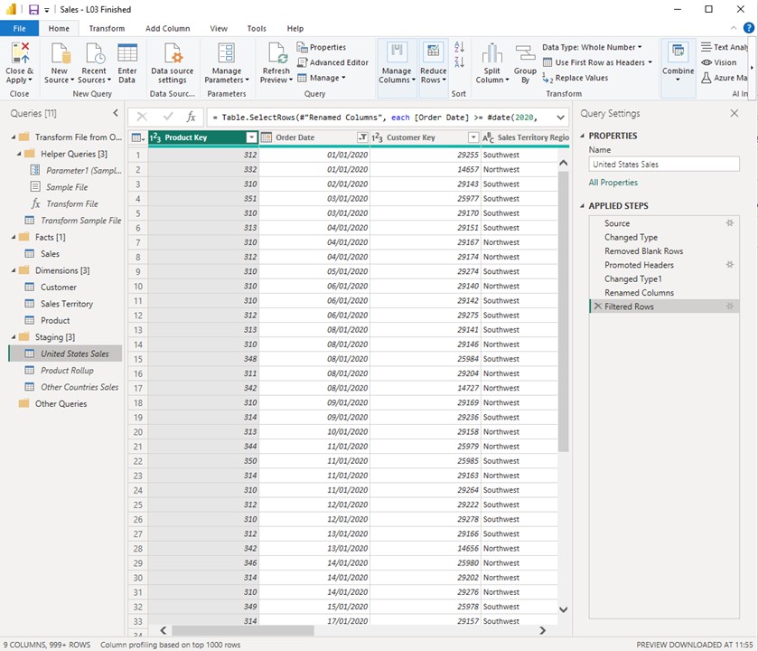 Conducted an overview of Power Query.
Imported United States sales data.
Imported customer data.
Imported sales territory data.
Imported product data.
Performed a product roll-up.
Merged the product and product roll-up queries.
Imported sales data from other countries and appended it to the United States sales data.
Created new columns as needed.
Managed model loading and performed final cleanup.
Organized and documented the entire Power Query process.
By optimizing these repetitive activities with Power Query, I significantly reduced the data preparation time, allowing me to focus more on analysis and delivering valuable insights.
Part Two - Enhancing the Data model
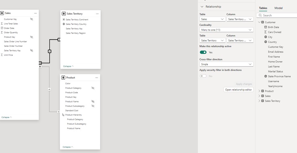
In the second part of my project, I advanced the development of my Power BI model by focusing on creating and refining relationships between tables in the data model. I began by arranging my tables in a Star Schema format within Power BI Desktop. This organization included placing the fact table—sales transactions—at the center and surrounding it with dimension tables such as customer, product, and sales territory. This arrangement helps in visualizing the model's structure and solidifies the concept of dimensional modeling.
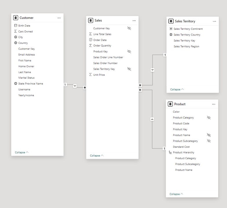
initiated the creation of relationships between these tables. Starting with the customer table, I established a relationship with the sales table based on the customer key, which Power BI identified as a one-to-many relationship. This relationship allows each customer to be linked to multiple sales transactions. However, while creating the relationship between the sales and product tables, Power BI defaulted to a many-to-many relationship due to duplicate entries in the product table. I addressed this issue by deduplicating the product table in Power Query, which corrected the relationship to a one-to-many state.
IAdditionally, I standardized column names in the sales territory table to ensure consistency before building the final relationship between the sales and sales territory tables. After standardizing the column names, I quickly established this relationship by dragging and dropping the relevant fields in Power BI, resulting in a one-to-many relationship with filters flowing from the dimension table to the fact table.
Throughout this process, I explored concepts such as cardinality and relationship direction, emphasizing the importance of managing duplicates and ensuring accurate data relationships. These steps enhance the model's effectiveness in filtering and reporting, ensuring that data analysis is accurate and reliable.
Next, I focused on refining data categorizations, formatting, and summarizations to enhance the usability and accuracy of my model. Firstly, I categorized geographical columns in my tables. For example, in the Sales Territory table, I designated the "Sales Territory Country" column as a "Country" type under Data Category. Similarly, I applied appropriate categorizations to other tables, such as marking "City" and "State or Province" in the Customer table. These categorizations help Power BI recognize and handle geographical data correctly, improving reporting accuracy and visualization.
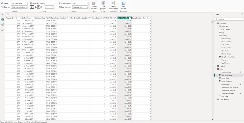
Next, I formatted numeric columns to ensure consistency in how monetary and other numerical data is presented. I set columns like "Line Total Sales" and "Unit Price" in the Sales table, and "Product Standard Cost" in the Product table, to display as currency with the format "English (United States)." For non-monetary numerical data, such as "Order Quantity," I added thousand separators to enhance readability. I also reviewed and adjusted the default summarizations for numeric columns.
By default, Power BI aggregates numeric data with the "Sum" function. I evaluated each column to determine the most appropriate summarization. For instance, I set "Yearly Income" in the Customer table to "Do not summarize," as summing this value would be incorrect. Conversely, for "Line Total Sales" and "Order Quantity," summing was appropriate. I chose to display "Unit Price" as an average rather than a sum to better reflect typical usage
Following this, I focused on constructing a product hierarchy and optimizing relationships within my Power BI model.
I created a product hierarchy by organizing data into a structured format. Starting with the Product table, I established a hierarchy with three levels: Product Category, Product Subcategory, and Product Name. Initially, I created a new hierarchy and renamed it to "Product Hierarchy" for clarity. I then added levels to the hierarchy by selecting the Product Category as the top level, followed by Product Subcategory and Product Name. After applying these changes, I ensured the hierarchy was visible in the model view and then hid the original columns (Product Category, Product Name, and Product Subcategory) outside of the hierarchy. This approach ensures that report users interact with the data through the hierarchy, simplifying data management and reporting. To improve data model efficiency, I refined the relationships between tables. Initially, relationships were based on text-based columns, such as Sales Territory Region in the Sales and Sales Territory tables, which is not ideal. Instead, I aimed to establish relationships using numeric keys. To achieve this, I used Power Query to merge the Sales table with the Sales Territory table on the Sales Territory Region column, incorporating the Sales Territory Key into the Sales table. After applying these changes, I deleted the old relationship based on text fields and set up a new, optimized relationship using numeric keys. I then removed the redundant Sales Territory Region column from the Sales table to streamline the data model and avoid duplication.
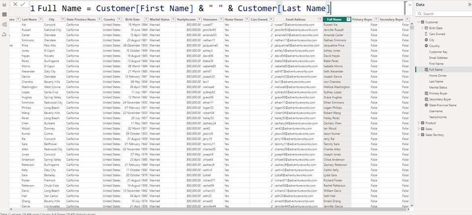
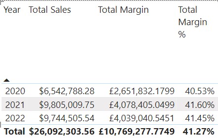
For Part Three, I focused on understanding DAX and its applications. I began by creating basic DAX expressions and logical expressions. Following this, I explored a comprehensive case that involved creating calculated columns and measures, progressively delving deeper into more advanced concepts over three parts. Additionally, I examined the use of the filter and all functions, enhancing my ability to manipulate and analyze data efficiently within Power BI. I created a new column called "full name" in the customer table by concatenating the first name and last name columns with a space in between. This was achieved by using the DAX expression, which pulled the first name and last name from the customer table and combined them into one cohesive full name column. After entering this expression, I verified that the new column was correctly displaying the full names for all 18,484 rows in the table. I initially tested the expression without specifying the table name in front of the column names, but I found that this practice, although allowed by the engine, made the code less readable and potentially less performant. By including the table name, the code became more explicit and understandable, particularly for other DAX professionals who might work with the model in the future. This reinforced the importance of maintaining good naming conventions and ensuring that expressions are both readable and efficient. Next, I moved on to creating a measure, another type of DAX expression, in the sales table. I right-clicked on the sales table and selected "new measure," then input a DAX expression to create a measure called "total sales." This measure summed the line total sales across all rows in the sales table. Unlike calculated columns, measures do not appear in the table until they are used in a report, providing context.
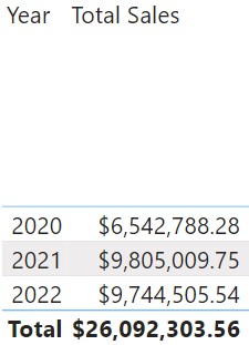
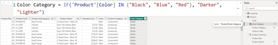
I also formatted the measure to display as a currency, specifically in English (United States) format, with two decimal places. This formatting made the financial data clearer and more professional. Once the measure was on the canvas, it had a context and displayed the total sales amount by summing all rows in the sales table. To enhance the report further, I added a year filter from the order date hierarchy. I did this by dragging the "year" column from the date hierarchy into the columns bucket above the "total sales" measure. This action segmented the total sales by year, allowing me to see the sales figures for each year individually (2020, 2021, 2022) as well as the grand total without any filter. Following this, I created a new column named "Primary Buyer". This column identifies customers based on two conditions: if the "Cars Owned" value equals zero and the "Customer Home Owner" status is "No." If both conditions are true, the "Primary Buyer" column returns a value of "true"; otherwise, it returns "false." The results showed that where both conditions were not met, the value was "false." The AND function was used here, which requires both logical expressions to be true to return a "true" value. Following the creation of the "Primary Buyer" column, another column named "Secondary Buyers" was added to the Customer table. This column identifies customers where at least one of two conditions is met: either the "Customer Car Owned" equals zero or the "Home Owner" status is "No." The OR function was utilized here, meaning that if either of these conditions is true, the "Secondary Buyers" column will return a value of "true." This approach captures a broader group of potential buyers compared to the stricter conditions of the "Primary Buyer" column. Next, in the Product table, colours were categorised into "Darker" and "Lighter" based on their specific values. A new column named "Category Colour" was created, applying the logic that if the Product Colour was either Black, Blue, or Red, it would be classified as "Darker." If the colour did not match any of these, it was categorised as "Lighter." This allowed for a clear distinction between the two colour groups, streamlining the data analysis process by grouping products based on their colour characteristics. To determine the cost associated with each sale, a new column called "Line Product Cost" was created in the sales table. This column calculates the cost by multiplying the sales order quantity by the standard cost from the related product table. The syntax reflects this operation, with the calculation performed on a row-by-row basis using row context. The expression was constructed within the sales table, where "Order Quantity" resides, and while it's not necessary to prefix "Order Quantity" with the table name, doing so enhances readability.
Later, a new column called "Line Margin" was created by subtracting the previously calculated "Line Product Cost" from the "Line Total Sales." This expression, applied on a row-by-row basis, leverages the row context to compute the margin for each line item. After hitting enter, the line margin values are now available for each row, providing a clear insight into the profitability of each sale.
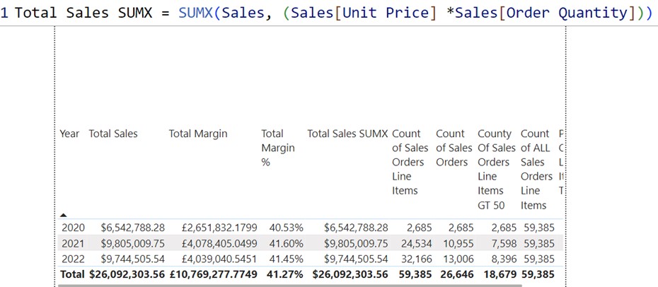
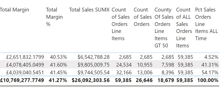
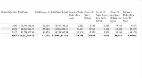
Next, I created a "Line Margin Percentage" column on a line-by-line basis. To do this, I right-clicked and selected "New Column." Leveraging the previously created "Line Margin," I divided it by the "Line Total Sales" using the DIVIDE function. This safe divide function includes an alternate result to handle divide-by-zero cases, ensuring error-free calculations. After hitting enter, the "Line Margin Percentage" values appeared. I then formatted these as percentages by clicking the percentage button. This resulted in accurate line margin percentages for each row, complementing the existing "Line Total Sales," "Line Product Cost," and "Line Margin" data. After building the total margin measure, attention shifted to creating a more complex measure: the total margin percentage. This measure calculates the total margin as a percentage of total sales. The process involved creating a new measure for total margin percentage, using the total margin and total sales measures as inputs. By applying the appropriate formatting and dragging this measure onto the reporting canvas, the calculation reflects accurate results by performing aggregation before division. This method ensures correct percentages by first summarising data at the appropriate level and then performing calculations. Moving forward, the focus shifted to reducing reliance on calculated columns, introducing the use of the SUMX function to dynamically calculate total sales. This function iterates through each row of the sales table, applying calculations and accumulating results. The measure created with SUMX provides the same results as previous calculations but does so on-the-fly, showcasing a step towards reducing dependence on static columns. The next lesson covered the COUNTROWS function, initially for counting sales order line items and later for counting distinct sales orders. This exercise demonstrated the ability to count individual line items and distinct sales orders, providing insights into sales data structure. The creation of a measure to count sales order line items greater than 50, utilising the FILTER function, further illustrated how to refine data before applying counting functions. In the final segment, the ALL function was introduced to override filter contexts, particularly useful for ratio calculations. By creating a measure that counts all sales orders regardless of the applied filters, and using this to calculate the percentage of sales order line items over time, it was demonstrated how the ALL function can ensure consistent denominators across various calculations. This function proves invaluable for accurate and meaningful ratio calculations in complex data scenarios. In this part, the focus was on constructing a date table and addressing the default auto date/time setting in Power BI, which needs to be disabled for better control. I covered constructing a custom date table within the model, explaining its significance for accurate time-based analysis. Establishing relationships between the order date and the sales fact table was demonstrated to ensure proper data connections. Additionally, basic time intelligence functions were explored, and an introduction to the CALCULATE function was utilised, setting the stage for more advanced data manipulation and analysis techniques.
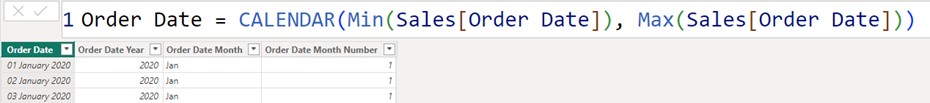
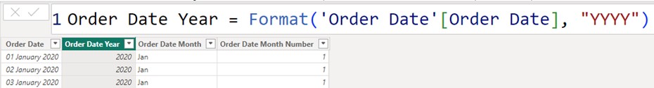
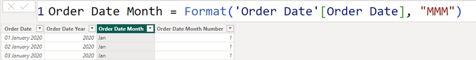
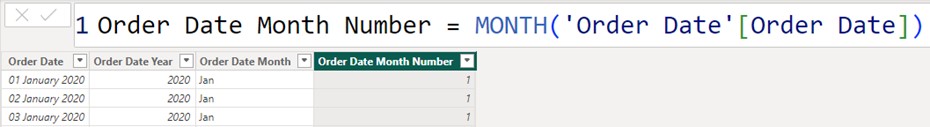
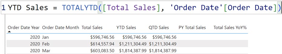
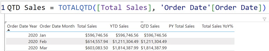
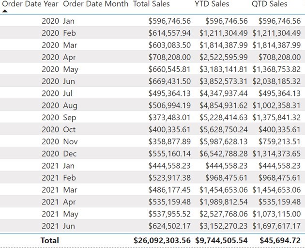
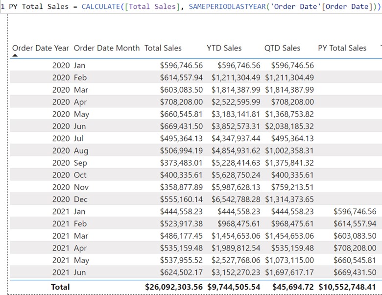
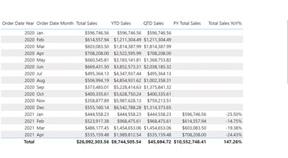
The initial step involved navigating to the table view, selecting "New Table" from the table tools, and then using the CALENDAR function in DAX to define a table named "Order Date". This function requires two parameters: a start date and an end date. To construct the table, the earliest date from the sales data was set as the start date, and the latest date from the sales data was set as the end date. This resulted in a table encompassing every day between these two dates. Once the table was created, the column labelled "Date" was renamed to "Order Date" to provide a more meaningful name. The data type for this column was adjusted from date-time to just date, removing any time components. Additional columns were then added to enhance the table’s functionality. A new column for "Order Date Year" was created by extracting the year from the "Order Date" column. Similarly, a column for "Order Date Month" was added to extract the month name, and another for "Order Date Month Number" was included to provide the numerical representation of the month. Subsequent to adding these columns, the data types were adjusted accordingly. The "Order Date Year" and "Order Date Month Number" columns were set to whole numbers, while the "Order Date Month" column remained as text. The default summarisation for the "Order Date Year" and "Order Date Month Number" columns was set to "Do Not Summarise" to ensure these fields are displayed correctly rather than summed. Following this, the focus was on utilising basic time intelligence functions within Power BI to analyse data over various time periods. The first time intelligence function demonstrated was the calculation of Year-to-Date (YTD) sales. A new measure was created in the sales table using the TOTALYTD DAX function. This function aggregates sales from the beginning of the year to the current date based on the "Order Date" column from the date table. Initially, the YTD sales measure appeared identical to the total sales for the year, as only yearly data was displayed. To address this, the month column was added to the visual, revealing that the values were sorted alphabetically rather than chronologically. To rectify this, the "Order Date Month" column was sorted by the "Order Date Month Number" in the table view, ensuring that the months were displayed in the correct sequence. With the correction applied, the Year-to-Date sales measure began to accurately reflect the cumulative sales up to the current date of each month, resetting at the beginning of each new year. The measure was formatted to display currency values correctly, ensuring that the numbers were clear and appropriately rounded. Following this, a new measure for Quarter-to-Date (QTD) sales was introduced. Similar to the YTD sales measure, a new measure was created using the TOTALQTD DAX function, which calculates sales from the start of the current quarter to the present date. The QTD measure was added to the visual, illustrating how the accumulation of sales resets at the end of each calendar quarter. Formatting adjustments were made to display the QTD sales correctly, with a focus on two decimal places for clarity. a measure called "Prior Year Total Sales" was created in the sales table. This measure employs CALCULATE to evaluate total sales from the same period in the previous year by modifying the filter context to reflect the prior year. The function was used to compare sales figures from January 2021 with those from January 2020, confirming that both amounts were $596,746. Formatting adjustments were made to ensure the measure displayed correctly. This exercise provided a foundational understanding of CALCULATE’s application in retrieving historical sales data. Quick Measures streamline the process of creating common calculations by providing pre-defined templates. I set up a year-over-year change calculation .The "Year-over-Year Change" option was chosen, with "Total Sales" set as the base value and the "Order Date" as the date reference. After adding the measure, a new DAX formula was generated, labelled "Total Sales YoY%."
The measure was added to the reporting canvas, revealing the percentage change in sales from one year to the next. For example, sales were shown as 25% lower for January 2020 compared to the previous year. For Part Five, I focused on refining my data visualisation skills. I started by navigating the report view and then created a range of charts to display my data effectively. I began with a clustered column chart to compare different categories side by side, followed by a stacked bar chart to show the composition of each category.
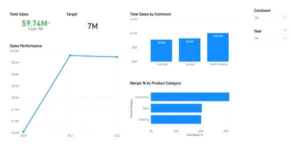
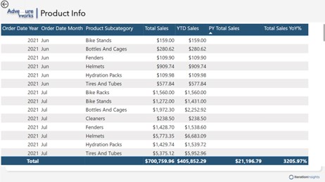
First, I selected the visual and placed the 'Sales Territory Continent' field on the X-axis and the 'Total Sales' measure on the Y-axis. This set up the basic structure of the chart with continents displayed against their corresponding sales figures. Next, I refined the visual by configuring its appearance. I accessed the formatting options and began with the X-axis, turning off its title to streamline the presentation. For the Y-axis, I adjusted the scale to a fixed range of zero to fifteen million to maintain consistency, regardless of filter changes, and also turned off its title. I then moved on to data labels, choosing to position them inside the end of each bar for better readability. I set the decimal places for these labels to one to ensure precision without clutter. After configuring these elements, I adjusted the visual’s size and position under the General tab, setting the width to 500 and the height to 250, with its position adjusted to 570 horizontally and 115 vertically. The next step involved adding a descriptive title, 'Total Sales by Continent,' formatted in bold with a font size of 14, and positioned it to the left to avoid interference with other UI elements. Finally, I changed the default sort order to ascending based on total sales, which allowed users to see the data in a more logical sequence and provided the flexibility for future adjustments. Overall, these steps ensured that the column chart was both visually appealing and functional, making it a valuable addition to my project’s data visualisation efforts. I then developed a stacked bar chart to showcase margin percentages across different product subcategories. To begin, I accessed the product hierarchy, enlarged it for better visibility, and then dragged the 'Product Subcategory' field onto the Y-axis of the chart. Once the basic chart was in place, I focused on formatting to enhance its clarity and appearance. I navigated to the formatting options and adjusted the general settings: setting the size to a height of 250 and a width of 500, and positioning the chart at coordinates 570 (horizontal) and 420 (vertical). For the title, I used the text 'Margin Percentage by Product Category,' ensuring it was clearly visible and appropriately sized. To provide additional context, I added extra information to the tooltips. Initially, the tooltip displayed the product category and total margin percentage. I wanted to enrich this with more data, so I included the 'Order Quantity' from the sales table. I modified the tooltip to reflect this addition, renamed the field to simply 'Order Quantity,' and verified that it displayed correctly when hovering over the chart bars. Furthermore, I ensured the visual supported interactive features such as drilling down and up through the hierarchy. This setup allows users to explore data from broader categories down to specific subcategories. By refining these elements, I created a functional and informative visualisation that would be effective for analysing margin percentages across various product lines. Then, I created a Line chart by selecting the 'Order Date Year' from my Order Date table and dragging it onto the X-axis. This laid out the timeline for my visual. Next, I went to the Sales table, found the 'Total Sales' measure, and dropped it onto the Y-axis, which immediately generated the line chart, showing the sales performance across different years. Once the basic chart was in place, I focused on enhancing its format and visual appeal. To start, I ensured the chart was selected, then accessed the 'Format Your Visual' settings. In the Visual tab, I streamlined the design by turning off the titles for both the X and Y axes, keeping the focus on the data rather than unnecessary labels.
To improve readability, I enabled 'Markers,' adding dots at each data point along the line. This subtle addition made it easier to identify specific values across the timeline. I kept the markers simple to maintain the chart's clean and straightforward look. I then moved to the General tab to fine-tune the chart's size and position. I adjusted the height to 425 and the width to 495, ensuring it fit neatly within the report. Finally, I positioned the chart at coordinates 40 (horizontal) and 255 (vertical), aligning it perfectly with other report elements. Finally, I added a title to the chart, naming it 'Sales Performance', and made sure the title was bolded to stand out. This consistent titling approach was applied to other visuals in my report as well, ensuring a uniform look and feel.
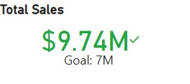
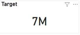
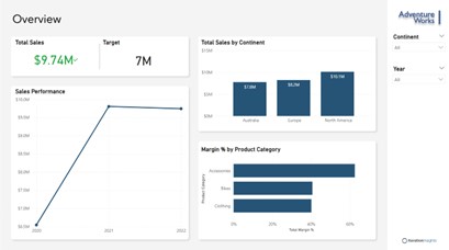
With these steps, I created a clear, informative line chart that effectively communicates the sales trends over the years, fitting seamlessly into the overall project. Next for my dashboard I wanted to create a KPI visual, I began by defining a target measure—a simple, static value of $7 million—to serve as a benchmark for comparison. Although in a real-world scenario, this target would be more complex and based on various parameters like dates, products, and territories, for this project, I kept it straightforward. After setting the target, I built the KPI visual by first dragging the total sales figure into the value field. I then added the order date year to the trend axis and used the $7 million target as the benchmark. This setup allowed the KPI visual to display a green indicator, confirming that our $9.74 million sales exceeded the target. To finalise the visual, I customised the format by increasing the callout value font size to 30, aligning everything centrally, and adjusting the display units to millions. I also disabled the trend axis and distance to goal cards to keep the visual clean. Finally, I adjusted the visual's size and position, and added a bold title, “Total Sales,” ensuring it was clearly visible and well-aligned within the report. To create the card visual, I first selected the card option from the visualizations pane and positioned it within the layout. I linked it to the target value from the sales table, ensuring the target was clearly displayed. Next, I adjusted the callout value to a font size of 30 to match the KPI card, and turned off the category label for a cleaner look. Finally, I added a bold title labelled "Target" and positioned the card precisely for a polished finish. To enhance the interactivity of my Power BI report, I added two slicers, ensuring they were both functional and visually consistent. First, I created a slicer linked to the Sales Territory Continent data, formatted as a dropdown for a clean look. I enabled multi-row selection and added a “Select All” option for flexibility. I customised the slicer header, renaming it to "Continent" and bolding the font for clarity. Then, I duplicated this slicer to create a Year slicer, adjusting the data source and formatting accordingly. This efficient method maintained consistent design while saving time. Finally, I positioned and resized both slicers to ensure they fit seamlessly within the report's layout. These slicers provide an intuitive way for users to filter data, enhancing the overall usability of the report. During my next step of the project, I explored advanced Power BI features to enhance my reports. I added a canvas background and theme for a consistent design, adjusted visuals, and created a custom tooltip for interactivity. I implemented drill-through, conditional formatting, and built an order date hierarchy with drill-down functionality. I also edited visual interactions, used the selection and bookmarks panes for organisation, and explored the filters pane. Then, I examined the structure of a PBX file to understand how Power BI manages report data. To enhance the visual appeal of my Power BI report, I added custom canvas backgrounds to each page, transforming the overall look from plain to professional. I started by selecting a suitable image for the overview page, ensuring the canvas background was in focus. After selecting the image, I adjusted the fit and set the transparency to zero, allowing the background to seamlessly integrate with the visuals. I repeated this process for other pages, selecting different backgrounds and making minor adjustments to fit the framing perfectly. Additionally, I renamed the pages to give them more meaningful titles, like "DAX Demos" and "Product Sales Details." These changes significantly improved the aesthetic quality of the report, making it more engaging and polished. The Before and After - *Slight differences in data due to completion of project* Next, I decided to enhance the user experience by creating a custom tool tip for a clustered column chart, replacing the default one with something more insightful. I began by creating a new page named "Sales Regions" and enabled it for use as a tool tip. I then adjusted the page settings to fit the tool tip layout. To make the tool tip meaningful, I added a pie chart to this page, which dynamically reflects the sales data by country. After setting up the visual elements
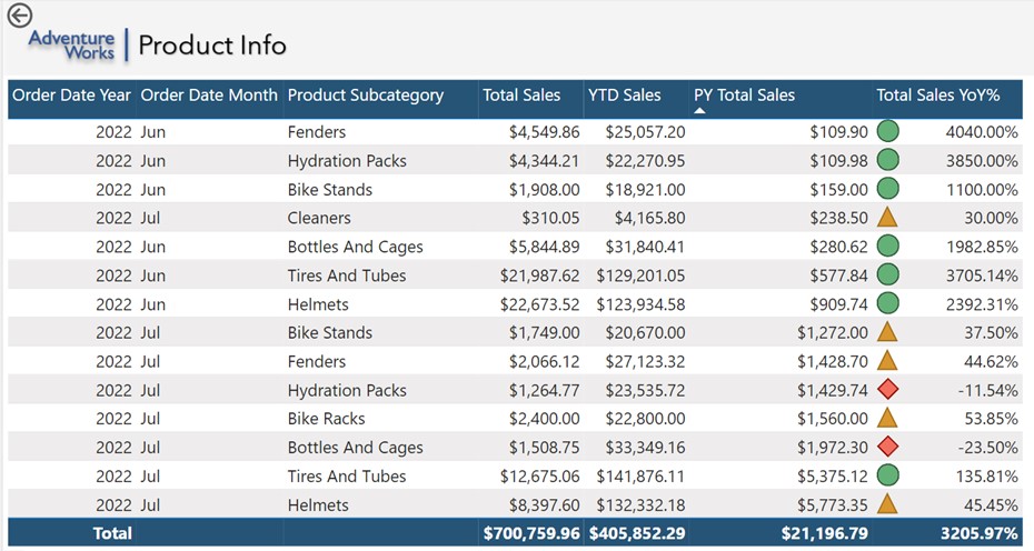
I customised the chart by removing the legend, adjusting the detail labels, and formatting the title to display "Total Sales by Country" in a bold, professional font. I then linked this tool tip to the main chart on the overview page by configuring the tool tip settings to display the newly created page when hovering over specific regions. This added a layer of interactivity, allowing users to see detailed sales data by country instantly, making the report not only more informative but also visually engaging. Following, I utilised conditional formatting to enhance the visual appeal and clarity of the data, ensuring that key trends are immediately noticeable. First, I selected the specific visual I wanted to format and set the format style to "Rules," applying it to the "Total Sales Year Over Year Percentage" field. I opted to display icons to the left of the data, aligning them at the top, and chose an icon set that visually represents performance. For the rules, I configured values so that increases between 0% and 100% appear in yellow, negative changes in red, and increases over 100% in green. This allows for an intuitive, colour-coded assessment of performance at a glance. I have successfully completed the Power BI project, covering a comprehensive range of topics to build proficiency in using Power BI within a business context.
Completing this project has been instrumental in advancing my career goals of becoming a graduate business analyst. I would like to extend my gratitude to LinkedIn Learning and the Complete Guide to Power BI for Data Analysts by Microsoft Press for making this project possible. Their guidance has equipped me with the skills and confidence to effectively leverage Power BI in my future role Here is the final tour of my Dashboard in PowerBI desktop. Please enjoy and feel free to contact me with the contact details below with any queries.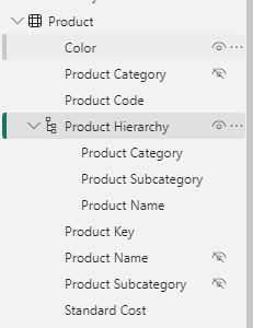
Part Three - Utilising DAX
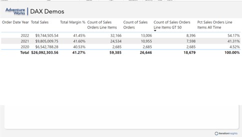
To see the value of the measure, I went to the reporting canvas, found the "total sales" measure in the sales table, and dragged it onto the canvas. By default, it appeared as a bar chart, which I then converted into a table matrix for better readability. I adjusted the font size of the table to make the data easier to read, ensuring that the values, column headers, and totals were all set to a larger, more readable font size.


Part Four - DAX Time Intelligence
The formula was then formatted using DAX Formatter, an online tool that improves readability by adding indentation and white space. This tool helps in understanding and maintaining the DAX code by making it more readable. The formatted code calculates previous year sales using the CALCULATE function, then computes the year-over-year change by dividing the difference between current and previous year sales by the previous year’s sales.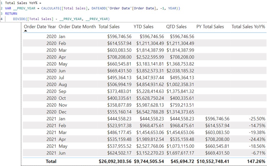
Part Five - Building Visualisations
I then added a line chart to illustrate trends over time. To track key performance indicators, I set up a KPI visual and created a card visualisation to highlight important single data points. Finally, I incorporated slicers to enable interactive filtering of the data. This process allowed me to build a diverse set of visuals and enhance my data presentation capabilities.
Next, I retrieved the 'Total Margin Percentage' measure from the sales table and placed it on the X-axis, which created the initial visual with margin percentages displayed for each product subcategory.
Part Six - Enhancing Visualisations
Conclusion
Part 1: Enhancing the data model with basic functionality.
Part 2: Delving deeper into the data model by introducing DAX Basics.
Part 3: Exploring DAX Time Intelligence to refine data analysis capabilities.
Part 4: Introducing quick measures to streamline data manipulation.
Part 5: Beginning to build desktop visuals, starting with the basics.
Part 6: Advancing to the next level in creating desktop visuals.